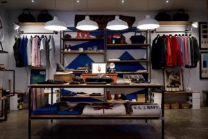
 One of the first things you need to think about when planning your store layout is what you want the customer to take away from the experience of interacting with your brand. In a general sense, you want customers to feel a positive association with your brand, to find your retail space attractive, uplifting, and engaging, and to be satisfied with their purchases, so they make repeat visits and encourage trusted contacts to patronize your brand, as well.
What you need to ask yourself, however, is how you can design a store layout that helps you to accomplish these goals in a practical sense. Do you want consumers to linger, or do you want to facilitate speedy transactions? Are you looking to attract a traditional or a modern crowd? How interactive do you want the experience to be? Answering such questions will give you clues about how to appropriately plan a successful retail layout and design. Here are a few factors to consider when creating a layout that supports your brand messaging and goals.
Setting the Stage
Just as businesses have goals for how long they would like virtual guests to remain on their product pages and shop online, you probably have an idea of shopping patterns you prefer in-store. Some businesses invite guests to take their time. Consider Nordstrom, which offers a luxury shopping experience.
Not only is apparel arranged in virtual islands of space so you can wander around the racks, but some stores also feature an attached café so customers can sit and relax with a drink and a nibble after a long day of shopping. Then there are stores, like Home Depot, where everything is neatly arranged in well-labeled aisles so you can find what you’re looking for quickly, and myriad attendants walk the store so help is never far.
The way you arrange the aisles, displays, and your layout, in general, gives shoppers clues as to the environment you’re inviting them to enter, and how they’re meant to interact with it.
Setting the Mood
The elements of your layout and design need to work together to create a cohesive ambiance that conveys a message to customers. Apple stores are a great example. Their clean, white, glowing stores are like a bright future in a box, much like the promise of their products. It’s a suitable vibe for a tech store.
Then there are stores like pottery barn that employ warm neutrals, golden lighting, wooden accents, and artfully arranged furniture and accessories to not only show their wares but exhibit an inviting, homey environment. Your store needs to elicit some kind of emotional response if you want to create a lasting rapport with customers.
Logistical Placement
Now that you know how you want customers to move through your space and connect with it emotionally, you have to consider the practical logistics of shopping. Naturally, you want to make the best use of your space, but lining walls floor-to-ceiling with products could make it difficult for customers to reach them. While this necessitates interactions with your charming sales associates, it could frustrate some independent shoppers into walking out.
In Conclusion
The point is, you need to think carefully about every aspect of your layout and how it translates into the shopping experience. This way, you can control how your layout affects visitors and what it tells them about your brand.
If you are interested in purchasing Retail Store displays and accessories for your retail store, shop our website, Specialty Store Services. We have everything you need to be a profitable retailer. If you have a question that you would like answered immediately, you can Live Chat, or phone us at 800-999-0771.
