
Retail store design is more than just product placement—it’s a psychological science.
Every detail, from how customers enter your store to where they pause, influences their time spent, engagement level, and total spend. For seasoned retailers, the key isn’t just getting customers in—it’s keeping them shopping longer without making them feel trapped or overwhelmed. The longer they stay, the more likely they are to buy.
The Decompression Zone: Set the Stage for Engagement
The first 5-15 feet of your store is known as the decompression zone—a critical area where customers transition from the outside world into your retail space.
Why This Matters:
When customers first walk in, their brains are processing new stimuli—lighting, temperature, sounds, and visual cues. Overloading them with too much signage, aggressive sales pitches, or high-ticket items right away causes decision fatigue, leading them to glance over your best products or leave quickly.
How to Optimize Your Decompression Zone:
- Minimize clutter – Keep this space open and inviting, allowing customers to adjust.
- Use soft visual cues – Flooring changes, different ceiling heights, or lighting shifts subtly guide them into your store.
- Avoid overwhelming messaging – No heavy promotions or impulse displays here; customers aren’t mentally ready to engage.
Pro Tip: Introduce a slow-motion trigger, like a focal display or lounge seating, to encourage a mental reset before they start shopping.
The Right Turn Bias: Guide Customers Intentionally
North American shoppers naturally turn right upon entering a store. This is known as the right-turn bias, and it’s a psychological behavior retailers can use to their advantage.
Why This Matters:
Since the right side of your store is the first real engagement point, it sets the tone for the rest of the shopping experience. If this area is weak or uninspiring, customers may lose interest early, leading to shorter visits and lower basket sizes.
How to Leverage It:
- Position high-margin and impulse products to the right of the entrance—this ensures immediate engagement (but be sure to keep them out of the decompression zone!).
- Use engaging visual displays (not just shelves!)—interactive screens, mannequins, or lifestyle setups work best.
- Avoid creating bottlenecks—if the space feels cramped, customers may turn around or skip it entirely.
Pro Tip: Test this strategy using heat map technology to confirm customer flow and optimize product placement accordingly.
Speed Bumps: Control the Pace of Shopping
Many retailers unknowingly allow customers to move through their stores too quickly, limiting their exposure to products.
Why This Matters:
Shoppers who walk at a fast, uninterrupted pace spend less time browsing, reducing the likelihood of impulse purchases and cross-category sales. By slowing them down, you create more opportunities for interaction, which leads to higher conversion rates.
How to Create Speed Bumps:
- Mid-aisle displays or kiosks – These naturally break up long aisles and encourage browsing.
- Height variation in displays – A mix of high, mid, and low levels forces the eye to travel, increasing product engagement.
- Cross-merchandising – Place complementary products together (e.g., handbags next to shoes) to create an intuitive shopping flow.
Pro Tip: Use interactive displays that require customer engagement, such as product samples or digital look books, to further slow traffic.
Readers Also Enjoyed: Use Candy Shelves and POP Displays to Increase $$$
Pathway Design: Balance Freedom & Direction
Retailers need to balance guided shopping flow with the feeling of personal choice. If customers feel trapped or forced into a specific path, they may exit faster or avoid certain sections.
Why This Matters:
The way customers move through your store determines how much of your inventory they see. Poorly designed pathways create:
- Traffic congestion (leading to frustration and early exits)
- Missed product exposure (customers skip entire sections)
- Shorter dwell times (less engagement = fewer sales)
Best Layouts for Maximizing Shopping Time:
Racetrack Layout (Loop Layout):
- Encourages full-store exploration by leading customers along a designated path.
- Works best for department stores, home goods, and lifestyle retailers.
Free-Flow Layout:
- Creates a more relaxed shopping experience with open movement.
- Best for boutiques, high-end stores, and experiential retail.
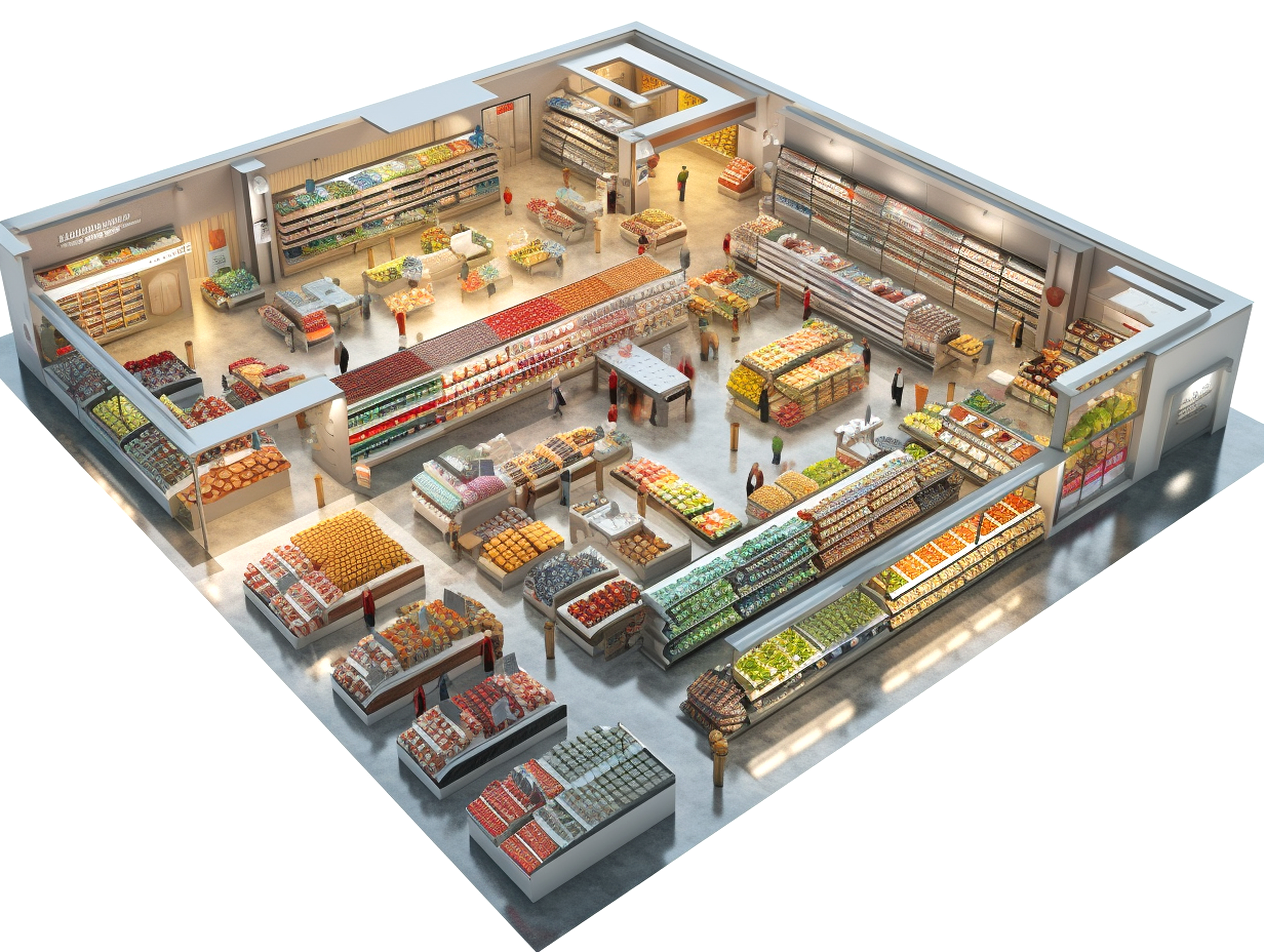
Grid Layout (Grocery-Style):
- Maximizes efficiency but can feel repetitive if not broken up with feature displays and focal points.
- Best for convenience stores, big-box retailers, and supermarkets.
Pro Tip: If using a grid layout, break monotony with strategic product pairings—e.g., a “weeknight dinner station” in a grocery store featuring pasta, sauce, and wine.
Strategic Product Placement: Keep Customers Moving & Buying
Product placement is one of the most underutilized tactics for extending shopping time.
Why This Matters:
Where you place products dictates customer movement and purchase behavior. Placing bestsellers near the entrance seems logical, but it reduces overall store exploration.
How to Optimize Placement:
- Move Bestsellers Midway into the Store – Forces customers to walk past more products before reaching them.
- Use End Caps for High-Margin Items – These grab attention without disrupting the main shopping path.
- Group Slow-Moving Inventory with Popular Items – Increases visibility and improves sell-through rates.
Pro Tip: Think of your store like a website’s UX design—products should be “breadcrumbed” strategically, leading customers deeper into the space.
Sensory Design: Engage More Than Just Sight
Most retailers focus on visual appeal—but engaging multiple senses creates a memorable, longer-lasting shopping experience.
Why This Matters:
Stores that engage more senses have higher dwell times, stronger brand recall, and increased sales.
How to Implement Sensory Triggers:
Scent Marketing:
- Studies show that scent can increase dwell time by 18% and boost revenue by 9% according to ScentAir.
Example: Vanilla or lavender in boutiques, fresh citrus in grocery stores to signal freshness.
Strategic Soundscapes:
- Slow-tempo music = longer shopping times.
- Genre-matching (e.g., classical music in luxury stores, upbeat pop in fast fashion) influences spending habits.
Tactile Engagement:
- Encourage touch with textured displays and “try before you buy” sections.
Pro Tip: Use localized sensory cues—e.g., woodsy scents and nature sounds in an outdoor gear store—to strengthen brand identity and emotional connection.
Final Thoughts: The Psychology of Store Layout Success
Retail store design is a science, not guesswork. Every decision, from pathways to sensory triggers, should be made with customer psychology and data-backed insights in mind. By optimizing layout strategies with intention, you’ll keep customers shopping longer, increase their interaction with your products, and ultimately boost overall sales.
Continue Your Journey with: Understanding Consumer Behavior Can “Print You Money”
Need help optimizing your store layout? Explore our expert retail fixtures & displays here!